
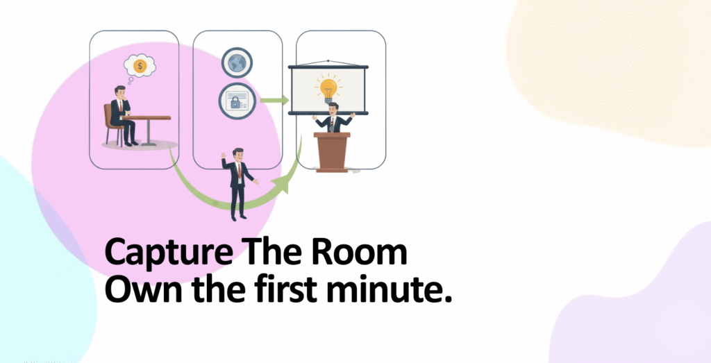
Complete guide to the pitch deck opening slide 2025: 7-second first impression window, company name + logo + tagline formula, value proposition in 8-12 words, design principles, real examples from Airbnb (Book rooms with locals), Dutchie (10% of all legal cannabis purchased through us), Peloton (Connected fitness at home), common opening slide mistakes, psychological principles investors expect.
Table of Contents
- The 7-Second Window: Your Only Chance
- The Opening Slide Formula: What Goes Where
- Company Name: Clear & Memorable
- Tagline & Value Proposition: 8-12 Words That Hook
- Design Principles: Visual Impact Without Clutter
- Real Examples: What Investors Remember
- Common Mistakes That Kill Opening Slides
- Best Practices: The Formula That Works
The 7-Second Window: Your Only Chance
Investors see 100+ pitch decks per month. Your opening slide gets 7 seconds maximum. Some research suggests even 5 seconds. In that window, they decide: keep reading or reject.
The Science of First Impressions
- 7-second rule is real: Studies show humans make subconscious judgments in under 7 seconds. Your cover slide must capture attention in that window or it’s rejected
- 60% of pitches rejected at cover slide: Poor design, unclear company name, confusing tagline = immediate rejection. Investors don’t think “I’ll give them benefit of doubt.” They think “next”
- Visual processing happens before reading: Investors see design + logo + colors BEFORE reading a single word. Visual impression hits first. If it’s sloppy, they’re prejudiced against your content
- Tagline clarity is critical: If investor reads tagline and thinks “what does this company do?”, you lost them. Vague taglines = vague understanding of market = rejection
What Investors Are Actually Judging
- Professionalism: Is this cover slide polished or amateur? If founder can’t design a clean slide, can they execute a company?
- Focus: Does company name + tagline clearly answer “What do you do?” Or is it confusing?
- Confidence: Does opener inspire confidence or doubt? Bold, clear design = confidence. Cluttered, unclear = doubt
- Clarity of thinking: Can founder articulate their value in 1-2 lines? Or is it vague, over-complicated? Clear thinking = fundable
The Opening Slide Formula: What Goes Where
There’s no single correct design, but the structure is consistent across successful pitches. Here’s what belongs on your cover slide.
The 5-Element Formula
| Element | What It Is | Example | Size/Placement | Why It Matters |
|---|---|---|---|---|
| 1. Company Logo | Visual mark representing brand | Airbnb “A” symbol | Top-left or center, 200-400px | Creates visual anchor. Memorable. Professional signal |
| 2. Company Name | Full name of company | “Airbnb”, “Dutchie”, “Peloton” | Below or beside logo, 60-100pt font | Must be readable in one glance. Clarity over creativity |
| 3. Tagline/Value Prop | One-line description of what you do | “Book rooms with locals, not hotels” | Below company name, 32-48pt font | Answers the question “What does this company do?” in 8-12 words |
| 4. Visual Element | Background image, shape, or product photo | Airbnb used photography of rooms | Full slide background or strategic placement | Makes slide memorable. But must NOT obscure text. Secondary to message |
| 5. Contact Info (Optional) | Founder email, date, presentation version | “john@startup.com | Series A Pitch | Dec 2025” | Bottom-right corner, 16-20pt font | Practical. Helps investor share deck with co-investors. Not essential but professional |
Layout Principles (Design Order Matters)
Visual Hierarchy Rules
1. Logo is anchor: Place logo where eye naturally rests (top-left or center). Logo sets visual tone
2. Company name is primary text: Largest, clearest text on slide. Should be readable from 10 feet away. No fancy fonts. Arial, Helvetica, or sans-serif modern fonts
3. Tagline is secondary text: Smaller than company name (about 60% of name size), but still prominent. Should not be tiny. Investors need to read this clearly
4. Background supports, doesn’t distract: If using background image (photo of product, office, visual metaphor), it should be subtle. Text must be readable over it. Use text shadow or semi-transparent overlay if needed
5. White/negative space is powerful: Don’t fill entire slide. Empty space communicates clarity, confidence, professionalism. Crowded slide = amateur
Company Name: Clear & Memorable
Your company name is the first thing investor reads (after visual impression). It must be crystal clear, easy to pronounce, and memorable.
What Makes a Company Name Work on Your Cover Slide
- Readable at a glance: Not tiny font. Not fancy script. Bold sans-serif, 60-100pt. Example: “AIRBNB” in clean, large sans-serif
- Pronounceable: If investor has to mentally decode pronunciation, it creates friction. Friction = rejection. Simple names win. Airbnb, Buffer, Canva, Figma = simple, pronounceable
- Related to what you do (ideally): Airbnb = air bed + breakfast. Dropbox = drop files in box. Peloton = exercise equipment. Name creates intuitive understanding of business
- Memorable: Rhyming names work (Buffer, Canva, Figma, Zendesk). Or single strong word (Uber, Slack, Notion). Avoid arbitrary words that require explanation
- No typos or odd capitalization: “AirBnB” vs “Airbnb” — the latter is clean, professional. Odd capitalization signals sloppiness
Company Name on the Slide: Practical Rules
- Size: 60-100pt minimum. Should be largest text on slide. If slides are projected, test readability from back of room
- Color: Use primary color (brand color) or solid black/white. Avoid light colors on light backgrounds. Contrast is critical for legibility
- Font: Modern sans-serif (Helvetica, Arial, Inter, Poppins). Not scripts, not serif, not fancy. Clean = professional
- Placement: Top-center, center-center, or top-left (next to logo). Consistency: if logo is top-left, name goes below or beside it. Not scattered
Tagline & Value Proposition: 8-12 Words That Hook
Your tagline is the most important text on the opening slide. It answers: “What does this company do?” in a way that instantly makes sense. This is where you win or lose investors at the 7-second mark.
The Tagline Formula (What Investors Expect)
Structure: Problem + Solution in Simplest Form
Best taglines follow this pattern: “[Benefit] for [target audience]” or “[Product] for [problem]”
Airbnb: “Book rooms with locals, rather than hotels” — This is a masterclass. “Book rooms” (what you do), “with locals” (unique angle), “not hotels” (vs competitor). Crystal clear in 7 words
Peloton: “Connected fitness at home” — What it is, where it’s used. 4 words. Clear
Dutchie: “10% of all legal cannabis in the world purchased through us” — This is traction as tagline. Impressive stat that tells the story. 13 words but memorable because it’s a powerful claim
Buffer: “Schedule tweets and manage social media easily” — Problem (managing social is hard), solution (Buffer makes it easy). 7 words
Tagline Anti-Patterns (What Kills Investors)
- Too vague: “Empowering businesses through technology” — Everyone says this. Not specific. Investor confused
- Too much jargon: “Leveraging AI-driven solutions for enterprise data orchestration” — Investor doesn’t understand. Rejected
- Too long: Anything over 15 words. Investor’s attention span = 5 seconds for tagline. Keep it short
- Doesn’t answer “what do you do”: “Building the future of X” — OK as mission, not as opening line. Investor still confused about actual product
- Comparing to yourself: “The Uber for pet sitting” is OK, but “Better than Rover because…” is on opener is defensive. Avoid
Tagline Best Practices (The Formula That Works)
| Tagline Type | Structure | Example | When to Use |
|---|---|---|---|
| Problem Solver | “[Solution] for [Problem]” | “Calendar for teams who hate meetings” | When problem is obvious and painful |
| Category Definition | “[New category] for [audience]” | “Slack: Where work happens” | When creating new product category |
| Comparative | “[Product] instead of [old way]” | “Airbnb: Book rooms with locals, not hotels” | When you have clear incumbent to replace |
| Benefit-Based | “[Key benefit] [where/how]” | “Figma: The collaborative design tool” | When benefit is core to positioning |
| Traction-Based | “[Impressive stat] [context]” | “Dutchie: 10% of all legal cannabis in US” | Only if stat is genuinely impressive (top 1%) |
How to Test Your Tagline
- Read it aloud: Does it flow naturally? Or sound awkward? Smooth delivery = good tagline
- Show to 5 people who don’t know your company: Can they describe what you do based on tagline alone? If yes, tagline works. If “I’m not sure,” rewrite
- Count words: Ideal = 6-12 words. If longer, cut ruthlessly. If shorter, add necessary context
- Remove jargon: Replace technical terms with everyday language. Investor should understand without Googling
- Make it specific: Not “a better way to manage X”, but “X in 5 minutes vs 5 hours” (specific benefit with comparison)
Design Principles: Visual Impact Without Clutter
Your opening slide must look professional. This doesn’t mean expensive, fancy design. It means clean, intentional, focused design.
Core Design Principles (Master These)
1. Contrast (Text vs Background)
Rule: Text must be highly readable. Use dark text on light background or light text on dark background. Avoid colors that blend
Example: White text on dark blue background = good contrast. Light gray text on light background = terrible contrast (illegible)
Test: Squint at slide. Can you still read text? If not, contrast is too low. Increase it
2. Consistency (Color & Typography)
Rule: Use 1-2 primary colors + neutral backgrounds (white, black, gray). Avoid rainbow of colors (looks amateur)
Example: Blue as primary (company color) + white background + gray accents. Consistent. Professional
Typography: Max 2 fonts. One for headers (Helvetica, Poppins), one for body (same font, different sizes/weights). Not 5 different fonts
3. Whitespace (Empty Space is Powerful)
Rule: Don’t fill the entire slide. Leave breathing room. 40% of slide can be empty space. That’s OK
Example: Logo in top-left corner (white space around it). Company name centered (white space above/below). Tagline centered lower. White space fills rest. Clean, professional, clear
Anti-pattern: Logo, name, tagline, background image, contact info, random shapes all crammed. Looks chaotic
4. Visual Hierarchy (Size Communicates Importance)
Rule: Largest = most important. Company name largest. Tagline medium. Contact info smallest
Example: Logo 300px, Company name 80pt, Tagline 40pt, Contact info 14pt. Clear hierarchy
Mistake: All text same size. Investor doesn’t know what to read first. Confusing
5. Background Images (Use Carefully)
Rule: If using background image (product photo, office, visual metaphor), it must NOT obscure text. Text readability is non-negotiable
Solution: Use dark overlay (semi-transparent black at 30-50% opacity) over image, then place light text on top. Or place image on one side, text on other side with white background
Airbnb example: They used photos of rooms as background, but kept text in clear areas. Photos enhanced visual appeal without killing readability
Mistake: Beautiful background photo that completely obscures white text. Looks pretty but investor can’t read tagline. Rejected
Design Tools & Their Costs
- Figma: Modern, collaborative, professional. Cost: $0 (free tier) or $12/month (pro). Learning curve: 4-8 hours to proficiency. Best for design-savvy founders
- Pitch (Pitch.com): Purpose-built for pitch decks. Templates included. Cost: $0-$50/month depending on plan. Learning curve: 1-2 hours. Best for non-designers
- Keynote/PowerPoint: Everyone knows these. Cost: $10-20/month (Office 365) or included in Apple ecosystem. Learning curve: none (probably already know it). Best for speed
- Design agency: Professional designer creates deck. Cost: ₹50,000-3,00,000 ($600-3600 USD). Learning curve: none (designer handles it). Best if budget allows
Real Examples: What Investors Remember
Airbnb’s Opening Slide (Series A 2010)
- What was on it: Airbnb logo (clean “A”), company name in large sans-serif, tagline “Book rooms with locals, rather than hotels” (7 words, clear), background with subtle photography of rooms
- Why it worked: Immediately clear what the company does. Comparison to hotels (incumbent) helps investor understand positioning. Visual metaphor (rooms) in background reinforces product without obscuring text
- Investor reaction: “Oh, I get it. This is interesting. Next slide”
Dutchie’s Opening Slide (Recent Pitch)
- What was on it: Dutchie name, tagline “10% of all legal cannabis in the world purchased through us” (powerful stat)
- Why it worked: Investor’s first reaction: “Wow, 10% is huge. This is a real company with real traction.” Stat immediately signals credibility and scale. Investor wants to know more
- Lesson: If you have impressive traction/stat, lead with it on opening slide. Don’t hide it in Slide 8
Peloton’s Opening Slide (Pre-IPO)
- What was on it: “Peloton” in bold sans-serif, tagline “Connected fitness at home” (4 words, crystal clear), visual of the bike in background
- Why it worked: Immediately clear what the product is. “Connected fitness” signals technology + exercise. “At home” signals convenient, personal. Visual of bike reinforces without overwhelming text
- Investor reaction: “Clear. Professional. Let me learn more about the business”
What All Successful Opening Slides Have in Common
- Clarity: No confusion about what company does
- Professional design: Not beautiful, just clean and intentional
- Focus: Only essential information (name + tagline + logo). Nothing extra
- Readability: Text is large, contrast is high, fonts are clear
- Confidence: Design communicates “we know what we’re doing”
Common Mistakes That Kill Opening Slides
Mistake 1: Vague Tagline (or No Tagline)
What founders do: “Empowering innovation” or “Building the future” or just company name with no description
What investors think: “I don’t know what this company does. Next”
Fix: Tagline must answer “What does this company do?” in 8-12 clear words. Test with 5 people — if they can’t describe your business based on tagline, rewrite
Mistake 2: Too Much Text
What founders do: Dump company mission, vision, value proposition, founder story all on opening slide. 50+ words
What investors think: “Too much to read. I lost them at word 15”
Fix: Opening slide = name + logo + tagline only. That’s it. Mission goes on next slides if needed
Mistake 3: Unclear Company Name
What founders do: Tiny font (24-30pt). Fancy script font. Unusual capitalization (AirBnB instead of Airbnb)
What investors think: “I can barely read this. Sloppy”
Fix: Company name in 60-100pt sans-serif. Bold, clear, readable from 10 feet away
Mistake 4: Poor Contrast (Unreadable Text)
What founders do: Light gray text on white background. Or dark text on dark background
What investors think: “Can’t read this. Did founder test this? Probably not”
Fix: High contrast. Dark text on light OR light text on dark. Test by squinting — you should still read it
Mistake 5: Distracting Background Image
What founders do: Beautiful background image that makes text unreadable. Investor has to strain to read tagline
What investors think: “Pretty but unprofessional. They prioritized looks over clarity”
Fix: If using background image, use overlay (semi-transparent dark layer) to ensure text readability. Or place image on one side, text on clear white space on other side
Mistake 6: Trying Too Hard with Design
What founders do: Animated text, gradient backgrounds, multiple colors, 3+ fonts, geometric shapes, visual effects
What investors think: “Trying too hard. Insecure about the actual business”
Fix: Simple, clean, intentional. No animations. 1-2 colors. 1-2 fonts. Whitespace. Professional = boring sometimes, and that’s OK
Best Practices: The Formula That Works
The 5-Step Framework for Creating a Killer Opening Slide
- Write your tagline first (before designing). Get it to 8-12 words. Test with 5 people. Make sure they understand what you do. Then move to design
- Choose company name color (primary brand color). This becomes your accent color throughout deck. Company name in this color on white or dark background
- Select ONE background element (optional). Either: solid color background (clean, professional), or subtle image with dark overlay (visual interest without distraction)
- Place elements with intention: Logo top-left or center. Company name centered or with logo. Tagline below company name. Contact info (optional) bottom-right. Whitespace everywhere
- Test readability: Squint at slide. Print on paper. View on projector from back of room. If you can read all text, you pass
Pre-Pitch Checklist
- Tagline clarity: Does it answer “what does your company do?” in 8-12 words? Show to 3 people — if they understand, you’re good
- Text size: Company name readable from 10 feet? Logo 200-400px? Tagline 40-50pt minimum?
- Contrast: Can you read text when squinting? Is contrast ratio high? (Use WebAIM contrast checker if unsure)
- Design consistency: Only 1-2 colors used? Only 1-2 fonts? Whitespace intentional?
- First impression: Show slide to someone for 7 seconds only. Can they tell you what company does and what it’s called? If yes, opening slide works
Final Opening Slide Formula (Memorize This)
| Element | Size | Color | Font | Content |
|---|---|---|---|---|
| Logo | 200-400px | Brand color | Original logo | Company mark |
| Company Name | 60-100pt | Dark (black or dark blue) on light, OR light on dark | Modern sans-serif (Helvetica, Arial, Poppins) | “Acme”, “Zenith”, “Buffer”, “Canva” |
| Tagline | 40-50pt | Same as company name OR secondary color | Same sans-serif as name | 8-12 word description of what you do |
| Background | Full slide | White (clean) OR dark color OR subtle image + overlay | N/A | Solid or visual metaphor (product image, office, etc.) |
| Contact Info | 14-18pt | Gray or light color | Sans-serif (smaller) | “founder@company.com | Series A Pitch | Dec 2025” (optional) |
Key Takeaways: Opening Slide Mastery
1. You have 7 seconds maximum. 60% of pitches rejected at cover slide. Visual impression + tagline clarity = accept or reject. No second chances
2. Opening slide = name + logo + tagline only. Nothing else. Mission, vision, founders, contact info are bonus, not required. Focus means clarity
3. Tagline is THE critical element. Must answer “what does your company do?” in 8-12 words. Test with 5 people. If they understand, you’re good. If they ask questions, rewrite
4. Company name in 60-100pt sans-serif. Large, clear, readable from 10 feet. Not fancy script, not tiny, not decorative fonts. Professional = boring sometimes. Accept it
5. Design philosophy: clean > beautiful. Not about impressive design. About clear, intentional design that doesn’t distract from message. Whitespace, 1-2 colors, 1-2 fonts
6. High contrast is non-negotiable. Dark text on light background OR light text on dark background. Squint test: if you can’t read while squinting, increase contrast
7. Real examples: Airbnb (“Book rooms with locals, not hotels” — 7 words, clear). Dutchie (“10% of legal cannabis in US through us” — impressive stat). Peloton (“Connected fitness at home” — 4 words, crystal clear)
8. Tagline formulas that work: “[Solution] for [problem]” (Calendar for teams who hate meetings). “[Product] instead of [old way]” (Rooms with locals, not hotels). “[Benefit] [where]” (Connected fitness at home). “[Impressive stat]” (only if genuinely impressive)
9. Background images can help, but must not obscure text. Use dark overlay (30-50% opacity) + light text if using image. Or image on one side, white background with text on other
10. Common fatal mistakes: vague tagline (“Empowering innovation”), too much text (>50 words), tiny company name (<30pt), poor contrast (unreadable text), distracting background, trying too hard with design
11. Logo placement: top-left or center, 200-400px size. Logo sets visual tone. Must be professional quality (not pixelated, not distorted)
12. Color strategy: use 1-2 colors only. Primary brand color + white/black + gray. Not rainbow of colors. Consistency signals professionalism
13. Typography: 1-2 fonts only. Modern sans-serif (Helvetica, Arial, Inter, Poppins). Not scripts, not serif, not decorative. Large sizes for clear hierarchy
14. Contact info (optional): bottom-right corner in 14-18pt. Helps investor share deck with co-investors. Not essential but shows thoughtfulness
15. Test your opening slide: (1) Write tagline, test with 5 people. (2) Design in tool (Figma, Pitch, or PowerPoint). (3) Check contrast (squint test). (4) Show to 1 person for 7 seconds ONLY. Can they tell you what company does? If yes, you’re done
16. Tools: Figma ($0-12/month, learning curve 4-8 hours), Pitch ($0-50/month, easy), Keynote/PowerPoint (free if you have it), Design agency (₹50K-3L for professional design)
17. Readability before aesthetics. Beautiful slide that’s unreadable = rejected. Boring slide that’s perfectly clear = accepted. Choose clarity
18. Opening slide signals team quality. Sloppy slide = sloppy execution. Polished slide = team that sweats details. First impression matters disproportionately
19. If you have impressive traction/stat, consider leading with it. Dutchie used “10% of legal cannabis” as tagline. Immediately signals credibility. Consider if your stat is top 1% impressive
20. Action plan: (1) Write tagline (8-12 words). (2) Test with 5 people. (3) Choose brand color. (4) Select simple background (white or dark or subtle image). (5) Place logo, name, tagline with intention. (6) Check contrast. (7) Run squint test. (8) Show to 1 person for 7 seconds. (9) If they understand what you do, you’re done. (10) Move to Slide 2