
Master slides 2-3 of your pitch deck (2025): Problem validation using P.R.O.V.E. framework, solution clarity without feature overload, customer journey mapping with real data, before-after visual storytelling, examples from Loom Front Canva, why 42% of startups fail due to weak problem validation, investor expectations decoded.
Table of Contents
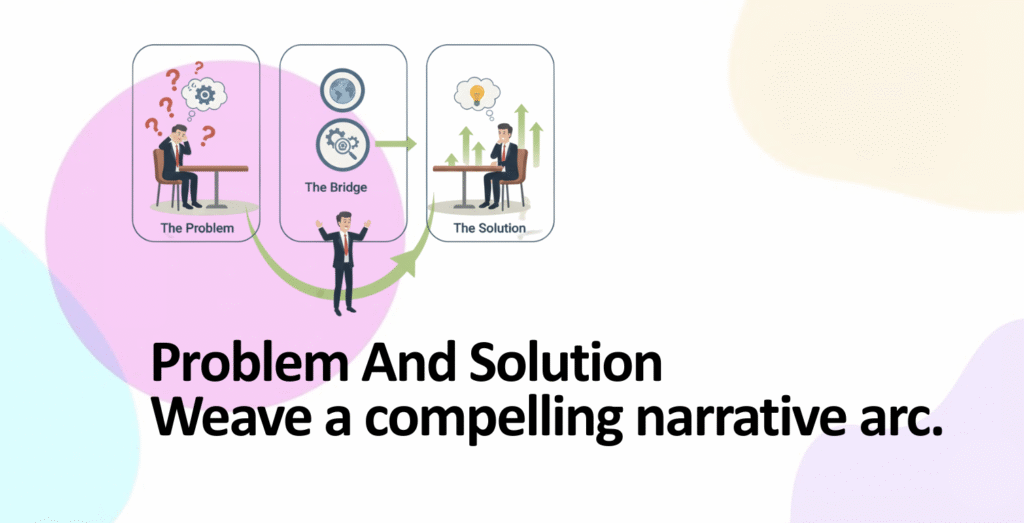
- Why Slides 2-3 Are Your Narrative Pivots
- Problem Validation: The P.R.O.V.E. Framework
- Building Specific Problem Statements (Not Vague Complaints)
- Solution Clarity: The Problem-Solution Bridge
- Customer Journey Maps: Visualizing Transformation
- Visual Techniques: What Investors Remember
- Real-World Examples from Funded Startups
- Common Pitfalls That Derail Slides 2-3
- Execution Checklist & Design Framework
Why Slides 2-3 Are Your Narrative Pivots
The cover slide hooks investors. Slides 2-3 convince them that your business deserves their capital. This is where abstract investor interest transforms into concrete belief in your solution.
The Critical Moment: Where Investor Momentum Builds or Breaks
- 42% of startups fail due to lack of market need (CB Insights): The number one reason founders face rejection isn’t bad execution—it’s a problem that doesn’t exist, isn’t painful enough, or has been misidentified. Your slides 2-3 either validate this gap or expose it as fictional
- 90% of startups fail; 29% fail due to cash flow issues directly tied to weak problem-solution fit: A founder pitches a solution to a non-problem. Customers don’t buy. No revenue. Burned out of cash. This chain begins with a weak problem-solution narrative
- Narrative structure increases investor confidence by 2.5x: Research shows pitch decks using clear problem-solution storytelling close funding rounds at 2.5 times higher rates than feature-list presentations. Story > Feature list, every time
- Investors expect problem validation first, solution optimization second: Investors don’t ask “How good is your product?” They ask “Is this problem real?” Answer that first. Product quality comes later
The Narrative Arc Investors Expect
| Slide 2 Role | Investor Psychology | Slide 3 Role | Investor Psychology |
|---|---|---|---|
| “This problem is real and quantifiable” | Moves from skepticism to curiosity | “This solution actually solves it” | Moves from curiosity to conviction |
| “X number of people face this pain” | Calculates market opportunity | “Here’s how it works, step-by-step” | Assesses feasibility & credibility |
| “It costs customers $Y annually” | Estimates willingness to pay | “Customer achieves outcome Z” | Validates value proposition |
Problem Validation: The P.R.O.V.E. Framework
Before building your problem slide, you must validate the problem exists. The P.R.O.V.E. framework (Problem Research, Observation, Validation, Evidence) guides you from hypothesis to proof.
The P.R.O.V.E. Framework Explained
P – Problem Hypothesis
State your core assumption about the problem. Not final truth, but testable hypothesis. Example: “Mid-market SaaS companies spend 12+ hours weekly managing customer data across disconnected platforms. This costs them $500K+ annually in lost productivity”
How to form: Start with observations from your life or work. What frustrates you? What do customers mention repeatedly? Write it down as a statement
R – Research & Observation
Go find evidence. Don’t build first; research first. Talk to at least 15-20 potential customers. Ask open-ended questions. Listen for pain, not validation
Research methods: Customer interviews (15-20 people), surveys (50+ responses), monitoring online communities (Reddit, Slack groups, Facebook groups where your customers gather), competitive landscape review (what are incumbents missing?)
Red flag: If everyone says “Yeah, that sounds annoying” but nobody’s actively looking for a solution, the problem isn’t painful enough
O – Observation Patterns
After research, identify patterns. What do 70%+ of respondents mention unprompted? What are they already doing to solve this problem (current workaround)? What would they pay to solve it?
Key insight: If people have already built a workaround (e.g., using spreadsheets for invoicing), they care enough to invest effort. That’s a signal
V – Validation Through Data
Quantify your findings. “85% of respondents mentioned X problem” is validation. “70% of interviews mentioned X problem” + “Industry reports show X costs $2B annually” is strong validation
Data sources: Industry reports (Gartner, McKinsey, Forrester), government data (US Census, BLS), academic research, your own primary research (surveys, interviews), credible market surveys
E – Evidence in Your Pitch
Now you have evidence. On your problem slide, cite this evidence. “Our interviews with 22 property managers showed 82% spend 6+ hours weekly on maintenance coordination” is compelling because it’s specific, quantified, and sourced
Building Specific Problem Statements (Not Vague Complaints)
Vague problems = vague understanding = rejected pitch. Your problem statement must be so specific that an investor could estimate market size and willingness to pay within 30 seconds of reading it.
The Specificity Formula: Who + Pain + Cost + Impact
| Formula Element | Vague Example | Specific Example | Why It Works |
|---|---|---|---|
| WHO (Target customer) | “Businesses struggle” | “Mid-market SaaS companies (50-500 employees) with decentralized sales teams” | Investor can estimate market size: ~5,000 companies in North America |
| PAIN (Specific friction) | “Managing data is hard” | “Sales managers manually consolidate data from 3-4 tools (Salesforce, Hubspot, email, spreadsheets) daily. Data is stale, inconsistent, and error-prone” | Investor feels the pain. Can see daily inefficiency |
| COST (Financial impact) | “Costs time and money” | “2 hours/day per sales manager × 20 managers × $75/hour × 250 working days = $750K annually per company in lost productivity” | Investor calculates: 5,000 companies × $750K = $3.75B addressable market |
| IMPACT (Business consequence) | “Bad for business” | “Data delays result in 15% longer sales cycles. Companies miss quarterly targets. This costs top performers $50K-100K in missed commissions annually” | Investor understands urgency. People will pay to solve this |
Problem Statement Template (Use This)
[TARGET CUSTOMER] spends [TIME/MONEY] on [SPECIFIC PAIN POINT] because [ROOT CAUSE]. This costs them [QUANTIFIED LOSS] annually. Industry-wide, this represents a [TOTAL ADDRESSABLE MARKET] opportunity.
Real example: “Freelance designers in North America (8.3M people) spend 6+ hours weekly creating and chasing invoices because existing tools require complex setup and multiple integrations. They lose $600-900 monthly to administrative overhead. The freelance invoicing market represents a $47 billion annual problem.”
Solution Clarity: The Problem-Solution Bridge
Your solution slide must visibly bridge from problem to solution. If an investor can’t see how your solution directly addresses your stated problem, the slide fails.
The Solution Clarity Test (Three Questions)
- Question 1: Does this solution directly address the stated problem? If your problem is “invoice creation takes 6 hours,” your solution must say “invoice creation takes 30 seconds.” Direct, measurable connection
- Question 2: Is the solution statement benefit-focused, not feature-focused? Bad: “Our app has cloud sync, API integrations, and real-time notifications.” Good: “Create and send invoices in 30 seconds. Get paid 3x faster. One platform for all clients”
- Question 3: Can an investor describe your solution in one sentence? If yes, you’ve achieved clarity. If no, simplify
Features vs. Benefits vs. Outcomes: Know the Difference
| Feature (What It Does) | Benefit (Why It Matters) | Outcome (What Changes) |
|---|---|---|
| “Cloud sync across devices” | “Access your work anywhere” | “Reduce context switching by 80%” |
| “AI invoice templates” | “Create professional invoices in seconds” | “Recover $600/month in billable time” |
| “Integrates 50+ accounting tools” | “One platform for all your clients” | “Reduce tool switching from 10+ platforms to 1” |
| “Automated payment reminders” | “Get paid faster” | “Payment delays drop from 30 days to 7 days” |
Investors read “cloud sync” and think “Many products have this, why care?” Investors read “recover $600/month” and start calculating customer lifetime value. Outcome > Benefit > Feature
Customer Journey Maps: Visualizing Transformation
A customer journey map shows the before-and-after state. Investors see not just that your solution is good, but how much better it makes customer life. This visualization is powerful.
The Before-State Journey (Current Inefficiency)
Map the customer’s current process. Identify where time is wasted, errors occur, and frustration builds.
| Step | Current Process | Tool | Time | Pain Point |
|---|---|---|---|---|
| 1 | Project completes | Slack/Email | – | No system reminder |
| 2 | Find client details | Email + Contacts | 10 min | Info scattered across platforms |
| 3 | Create invoice manually | Word/Sheets | 30 min | Manual, inconsistent, error-prone |
| 4 | Send via email | 5 min | Can get lost in inbox, no tracking | |
| 5 | Chase payment manually | Email + Spreadsheet | 20 min/week | No automation, easy to forget |
| Total: 65+ minutes per invoice. Zero automation. High error rate | ||||
The After-State Journey (Optimized Process)
Now show how your solution compresses and simplifies this. Same outcome (invoice sent, payment collected), but faster, simpler, automated.
| Step | Your Solution Process | Tool | Time | Improvement |
|---|---|---|---|---|
| 1-2 | Client data auto-populated, template ready | Your App | 20 sec | One platform. No jumping between tools |
| 3 | Click “Send Invoice” | Your App | 10 sec | Instant. Professional. Trackable |
| 4-5 | Automatic reminders + dashboard tracking | Your App (automated) | 0 min (automatic) | No manual follow-up needed |
| Total: 30 seconds per invoice. Fully automated. Zero errors | ||||
How to Visualize This on Your Slide
- Option 1 (Best): Split slide 50/50. Left = before journey (5 boxes, cluttered, slow). Right = after journey (3 boxes, clean, fast). Use icons for clarity: clock icons showing time reduction, checkmark for automation
- Option 2: Single horizontal flow diagram. Show the transformation visually: messy fragmented process → clean unified process. Use color: red/orange for problems, green for solutions
- Option 3: Timeline diagram. Horizontal timeline showing “old process: 65 minutes” vs. “new process: 30 seconds.” Visual is immediate and impactful
Visual Techniques: What Investors Remember
70% of venture capitalists prefer visual information over text. Your problem and solution must communicate visually without needing long explanations.
Technique 1: Before-After Side-by-Side
Split your slide down the middle. Left side = current state (messy, slow, error-prone). Right side = your solution (clean, fast, reliable).
Visual metaphor examples:
- Supply chain problem: Left = broken chain icon with red X’s at failure points. Right = complete green chain. Instantly clear
- Invoice problem: Left = 5 overlapping windows (email, spreadsheet, contacts, payment processor, calendar). Right = one unified dashboard. Visual proof of consolidation
- Communication problem: Left = messages scattered across platforms (Slack, email, SMS, teams). Right = one inbox. Clutter → clarity
Technique 2: Pain Point Icons & Annotations
Use simple icons to mark where friction exists on your journey map.
- Clock icon with X: Time wasted
- Error symbol: Mistakes, compliance risk
- Money icon with downward arrow: Lost revenue, costs
- Frustrated face: Customer dissatisfaction
- Scattered boxes: Fragmented systems
These visual markers make your problem jump off the slide. Text says “manual work is inefficient.” Icon says the same thing 10x faster
Technique 3: Data Visualization (Graphs, Not Numbers)
If you have problem data, visualize it. A bar chart showing lost productivity is more impactful than text saying “We lose X hours.”
- Bar chart: “Time spent on invoice management by company size” shows increasing cost as companies scale
- Line graph: “Payment delays over time (2019-2025)” shows upward trend, proving problem is worsening
- Pie chart: “Where does time get wasted?” 40% finding data, 35% manual entry, 25% chasing payment
Technique 4: Product Mockup (Show, Don’t Describe)
If you have a product, show it. Real UI mockup beats hypothetical description. Screenshot or prototype, not wireframe. Show the moment of value: “Invoice created in 30 seconds”
Best practice: Annotate key features. Don’t show entire interface. Zoom in on the critical moment. Arrow pointing to “One-click send” with label “30 seconds vs. 6 hours”
Real-World Examples from Funded Startups
Loom’s Problem-Solution Narrative (Seed: $3M)
Problem: “Endless back-and-forth messages and video calls kill productivity. Teams waste hours explaining simple concepts via meetings”
Solution: “Asynchronous video. Show, don’t tell. Send a 2-minute video instead of 30-minute meeting”
Why it worked: Emotion first (relatable problem—everyone’s been in this situation), then logic (async video is obvious solution). The problem slide made investors feel the pain
Front’s Collaborative Inbox (Series A)
Problem: “Customer communication is fragmented. Teams manage email, Slack, social media, chat—all separately. Context is lost. Responses are delayed”
Solution: “Unified inbox. All customer communication in one place. Collaborate internally. Respond faster”
Visual approach: They showed the before state (email inbox + Slack + Twitter open simultaneously, chaotic). After state (one Front inbox, organized). The visual made the value immediately obvious
Canva’s Design Democratization (Series B)
Problem: “Design is expensive and gatekept. Small businesses can’t afford designers. Design tools are complex and require training”
Solution: “Drag-and-drop design. Templates for everyone. Professional results without design experience”
Why it resonated: Problem was emotional (inequality, frustration). Solution was democratic (empowerment). They showed a before-after: blank canvas vs. professional design in 5 minutes
Common Pitfalls That Derail Slides 2-3
Pitfall 1: Problem Without Validation (Opinion, Not Evidence)
What you do: “Businesses struggle with X. Everyone we talked to mentioned it.” No data. No sources
What investors think: “That’s anecdote, not evidence. Show me credible data”
Fix: Cite sources. “Gartner reports 68% of companies cite X as their top operational challenge (2024).” Add your own research: “Our interviews with 25 property managers confirmed this: 82% spend 6+ hours weekly on maintenance coordination”
Pitfall 2: Solution Without Connection to Problem
What you do: Problem slide about administrative burden. Solution slide about AI capabilities. Investor confused about how AI solves admin burden
Fix: Explicitly state the bridge. “Problem: 6 hours/week on invoice management. Solution: AI-powered invoice creation. Result: 30 seconds per invoice. 96% time savings”
Pitfall 3: Feature List Instead of Outcome Statement
What you do: “Our platform has cloud sync, real-time collaboration, mobile app, API integrations”
What investors think: “Every SaaS has these. Why should I care?”
Fix: “Reduce invoice turnaround from 3 days to 30 minutes. Enable team collaboration without context switching. One platform for all customer interactions”
Pitfall 4: Problem Too Broad or Too Vague
What you do: “Productivity tools are fragmented.” “Companies want better tools.” “Innovation is needed”
Fix: Narrow. Specific. “Mid-market SaaS sales teams (100-500 people) manually consolidate data from 4+ tools daily. This causes 15% longer sales cycles and $500K annual revenue loss per company”
Pitfall 5: Overcomplicated Visuals (Too Much Information)
What you do: Journey map with 15 steps, 10 different icons, multiple data overlays, text everywhere
Fix: Simplify. 5 steps max. 1-2 icons. One key metric. Whitespace everywhere. Investors should understand your visual in 5 seconds
Execution Checklist & Design Framework
Pre-Slide Build Validation Checklist
- Problem research: Have you conducted 15+ customer interviews about this problem? Can you cite 3+ credible sources validating it?
- Specificity test: Can you describe your customer in one sentence without saying “anyone”? Do you know their job title, company size, annual spend?
- Quantification: Can you put a number on the problem? Annual cost? Time wasted? Revenue lost? If not, research more
- Solution connection: Does your solution directly address your stated problem? Can an investor see the line from problem to solution?
- Benefit focus: Did you describe outcomes (what changes) instead of features (what it does)?
- Visual test: Can someone understand your problem/solution from visuals alone, without reading text?
Slide 2 (Problem) Design Framework
| Element | Content | Visual Treatment | Space Allocation |
|---|---|---|---|
| Headline | “[TARGET CUSTOMER] loses [QUANTIFIED AMOUNT] to [PROBLEM]” | Large, bold, color accent | 20% of slide |
| Problem Data | 1-3 key statistics with sources cited | Graph or visual representation | 40% of slide |
| Customer Journey (Before) | 5-step process showing pain points | Simple flow diagram with icons | 30% of slide |
| Whitespace | – | Clean background, breathing room | 10% of slide |
Slide 3 (Solution) Design Framework
| Element | Content | Visual Treatment | Space Allocation |
|---|---|---|---|
| Headline | “[SOLUTION NAME]: [KEY OUTCOME]” | Large, bold, green/positive color | 15% of slide |
| How It Works | User journey or simple process diagram | Visual flow showing solution steps | 35% of slide |
| Before-After Comparison | Side-by-side: old process vs. new | Red/orange (before) vs. green (after) | 35% of slide |
| Key Metrics | “30 seconds per invoice” or “96% time savings” | Bold number with context | 10% of slide |
| Whitespace | – | Clean, organized layout | 5% of slide |
Presentation Timing Guide (Live Pitch)
- Slide 2 – Problem (60-90 seconds): Hook (15 sec) → Customer pain story (30 sec) → Data validation (20 sec) → Market scale (15-25 sec)
- Slide 3 – Solution (60-90 seconds): One-line solution (10 sec) → How it works (30 sec) → Before-after transformation (20 sec) → Key outcome/metric (10 sec)
- Total (2-3 minutes): Investors should feel the problem emotionally, then see the solution logically
Key Takeaways: Problem-Solution Mastery
1. 42% of startups fail because they misidentify or ignore the actual problem. Your slides 2-3 either validate that a real problem exists or expose your business as built on assumptions. Get this right
2. Narrative structure increases investor confidence by 2.5x. Problem + emotion + logic = persuasive narrative. Feature list = boring rejection
3. Use the P.R.O.V.E. framework for problem validation: Problem hypothesis → Research & observation → Observation patterns → Validation through data → Evidence in your pitch. This progression ensures credibility
4. Specificity = credibility. Vague = rejection. “Everyone wants better tools” signals you haven’t done customer research. “Mid-market SaaS with 50-500 employees loses $750K/year” signals you understand your market
5. The Who + Pain + Cost + Impact formula quantifies your problem statement. Who (target customer), Pain (specific friction), Cost (financial impact), Impact (business consequence). All four together create a credible, fundable problem statement
6. Features don’t matter. Outcomes do. “Cloud sync” is a feature. “Recover $600/month in billable time” is an outcome. Outcomes sell. Features are supporting details
7. Customer journey maps visualize transformation. Show before-state (65 minutes, manual, error-prone) vs. after-state (30 seconds, automated, reliable). Visual proof of impact is compelling
8. 70% of VCs prefer visuals over text. Your problem and solution must communicate visually. If an investor can’t understand from a visual alone, redesign
9. Problem-solution must connect explicitly. If investor can’t see how your solution addresses your stated problem, the slide fails. Make the connection obvious
10. Real examples: Loom (emotion-first narrative), Front (visual before-after), Canva (problem is emotional + solution is empowering). Each led with narrative strength, not feature strength
11. Common pitfalls: problem without validation (anecdote not evidence), solution without connection, features not outcomes, problems too broad, visuals too complex. Avoid these and you’re in the top 20% of pitches
12. Data sources matter: industry reports (Gartner, McKinsey), government data (Census, BLS), academic research, customer interviews (with sample size), credible surveys. Cite sources. Investors verify
13. Slide 2 design: headline + problem data (visual) + customer journey (before-state) + whitespace. Keep it clean. One idea per slide. 5 steps max in any journey
14. Slide 3 design: headline + how-it-works diagram + before-after comparison + key metric + whitespace. Visual should communicate value in 5 seconds without narration
15. Timing: spend 60-90 seconds on problem, 60-90 seconds on solution. Longer won’t help. Get to the point faster. Investors have read 100+ decks. Clarity and speed matter
16. Before-after visual technique is the most powerful. Split slide 50/50: left (messy, slow, manual, error-prone) vs. right (clean, fast, automated, reliable). This single visual proves your value
17. Pain point icons (clock, error, money, frustrated face) make problems visually obvious. Faster visual processing than text. Use them
18. Data visualization (graphs) beats raw numbers (text) every time. Bar chart showing cost growing over time is more memorable than text saying “costs increasing”
19. Product mockup should show the moment of value. Not entire interface. Zoom in on critical feature. Annotate: “Invoice created in 30 seconds vs. 6 hours”
20. Action plan: (1) Validate problem using P.R.O.V.E. framework. (2) Write Who + Pain + Cost + Impact statement. (3) Create before-state customer journey. (4) Design before-after visual. (5) Write benefit-focused outcome. (6) Test with 3 people: “Can you summarize my problem and solution in one sentence?” (7) If yes, slides work. If no, simplify further